HDFC MF Investment app

HDFC Mutual Funds AMC
HDFC Mutual Funds AMC
Year
'23
Client
HDFC Mutual Funds AMC
Service
Product design
A UX overhaul for HDFC Mutual Fund that balances financial complexity with design clarity, helping users invest with confidence, not confusion.
Introduction
HDFC Asset Management Company (AMC) Ltd., widely known as HDFC Mutual Fund, is one of the most trusted and established players in India’s mutual fund industry. Backed by the legacy of the HDFC Group and the global expertise of Standard Life Investments, the platform offers a diverse range of schemes catering to various investor profiles—from cautious first-timers to seasoned wealth managers.
With over 210 branches across 200+ Indian cities, the brand enjoys not only a vast geographic footprint but also a powerful emotional connect with its users. However, in the digital age, even the strongest legacies need to evolve.
The challenge
Investments are deeply personal. Users aren’t just clicking buttons, they’re entrusting a platform with their hard-earned money and financial dreams. And yet, the existing HDFC Mutual Fund website failed to communicate this sense of care and clarity. It was functional, yes—but far from intuitive. Through stakeholder interviews, heuristic evaluations, and usability testing, we identified key pain points:
1. Information Overload
Users often landed on dense pages packed with financial jargon, multiple CTAs, and very little contextual guidance. Many didn’t know where to begin.
2. Trust Gaps for New Users
While HDFC as a brand was trusted, the digital experience didn’t instill the same confidence—especially for users unfamiliar with mutual fund terminology.
3. Clunky Navigation
Key actions like comparing schemes, starting a SIP, or tracking a portfolio required multiple steps and weren't easily discoverable.
4. Outdated Visual Language
The design lacked cohesion and didn't reflect the brand's stature in the financial domain. Icons, charts, and layouts felt generic and dated.
5. Mobile Accessibility Issues
In a country with increasing mobile-first behaviour, the site’s experience on smaller screens was suboptimal resulting in high drop-off rates.
6.Regulatory Boundaries from SEBI
As with any platform operating in the financial domain, especially mutual funds, there were strict compliance guidelines laid out by SEBI (Securities and Exchange Board of India). From how data could be presented to the wording of disclaimers, many design decisions had to walk the fine line between creativity and compliance. For instance, we couldn’t tweak certain labels, modify statutory disclosures, or promote any scheme too aggressively—even if a better UX begged for it. It was a masterclass in constraint-based design and we embraced it.
Our Approach
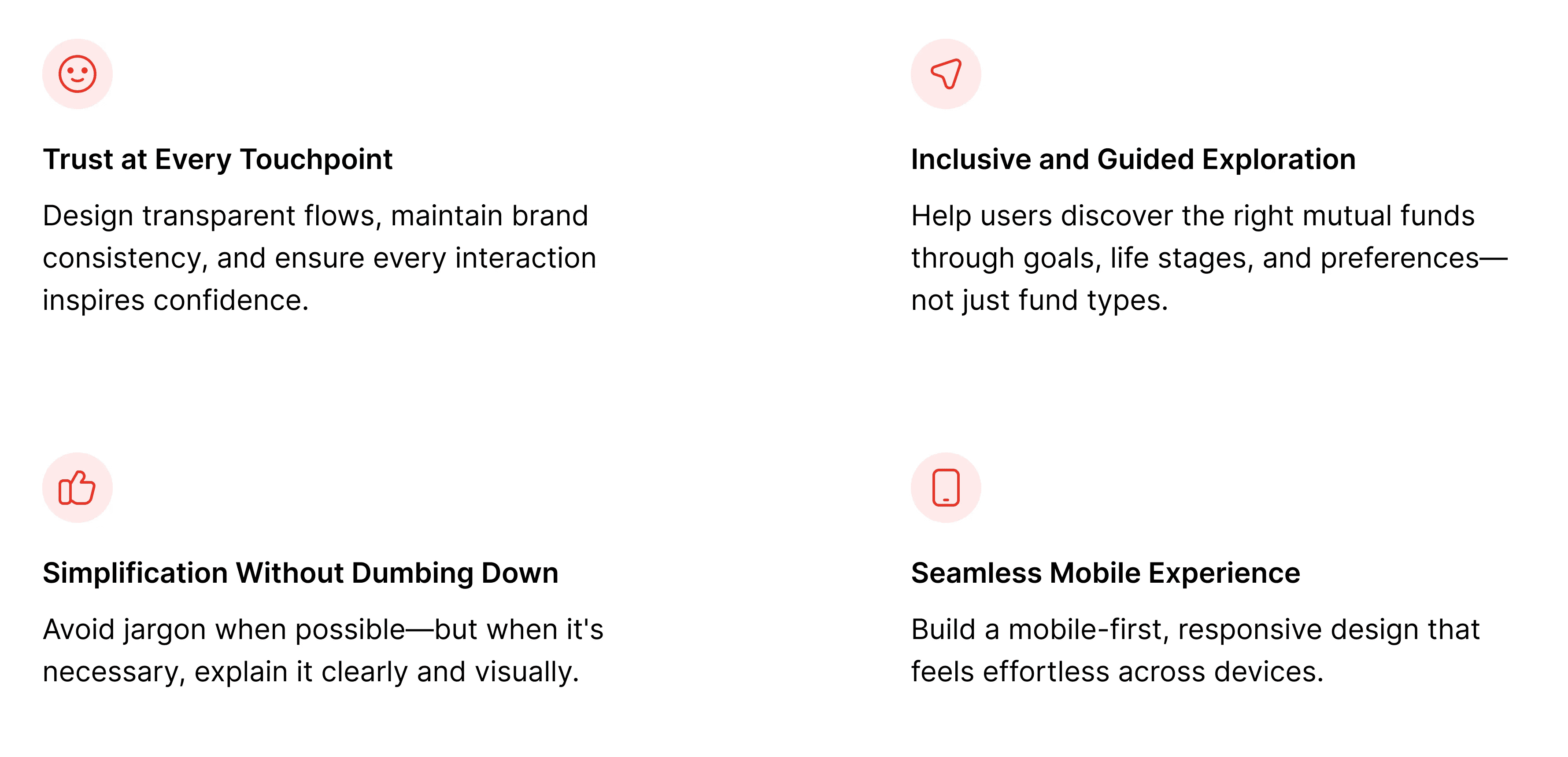
We grounded our design strategy in the principles of clarity, trust, and empowerment. The goal was to help users feel in control of their investment journey—whether they were just starting out or actively managing a multi-crore portfolio.
Market & Competitor research
We evaluated both traditional AMCs and modern digital investment platforms to understand the current experience landscape.

Our takeaway: HDFC had the brand trust. What it needed was modern experience design to match.
We didn’t just solve problems, we reimagined the experience from the ground up. Here's how we brought the new HDFC Mutual Fund platform to life
Investments made mutually engaging
Accessing the dashboard was quite a complex task. We simplified the login process by making it shorter, more engaging, and consequently, convenient. With a simple and clean touch of aesthetics, the work portfolio became easy to understand too. The overall look and feel of the website was translated to one that is less overwhelming, more welcoming.
1. Welcome Redesign: From Login to Dashboard
We streamlined the login process and designed a dashboard that felt more like a personal investment assistant than a control panel. Key actions like “Track My Investments,” “Start a SIP,” and “Explore Funds” were surfaced upfront.
2. Fund Discovery That Makes Sense
Instead of listing funds by categories users didn’t fully understand, we added goal-based discovery. “Planning for Retirement?”, “Saving for Your Child’s Education?”, or “Looking for Tax Benefits?” each goal led to curated schemes with relevant information.
3. Content That Educates, Not Confuses
We paired financial information with helpful tooltips, microcopy, and short explainer videos. We also implemented glossary modals for financial terms just in case users wanted to impress their accountant later.
4. Visualising Data With Empathy
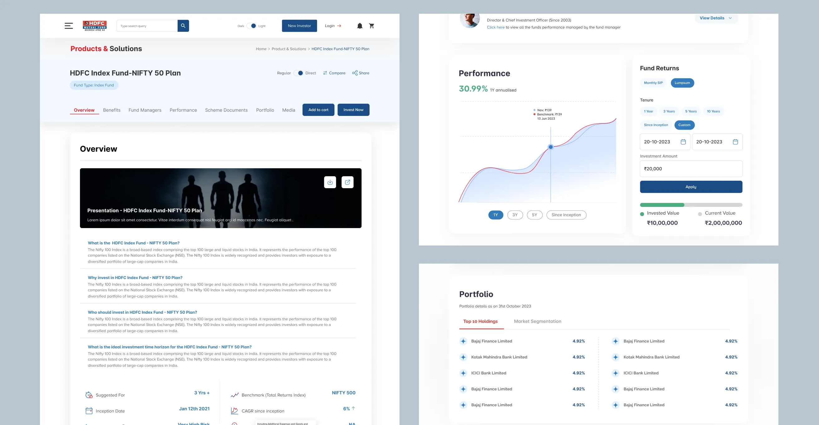
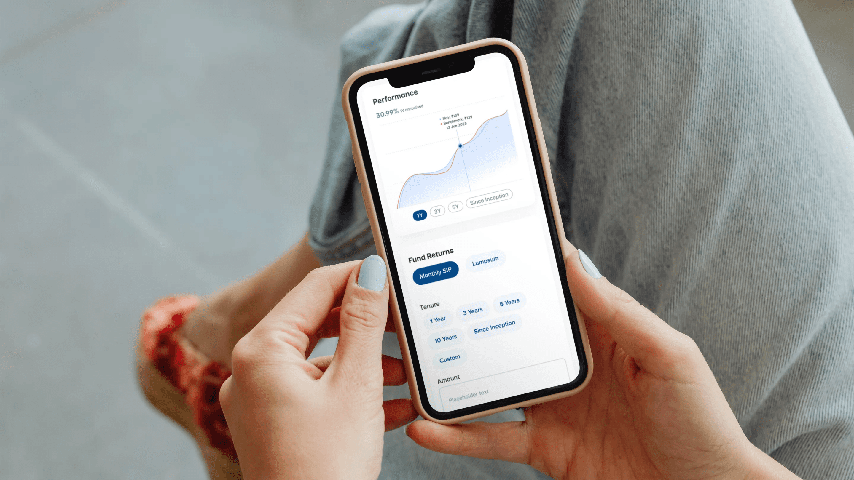
Interactive graphs replaced static data tables. Users could now toggle views, compare schemes, and explore fund performance over time all through responsive, accessible visual components.
5. Interactive Tools That Empowered
We developed calculators for SIP planning, tax-saving potential, and long-term projections each with real-time feedback and simple sliders. The tools not only supported decisions but encouraged users to experiment and learn.
6. Consistency, Responsiveness, and Delight
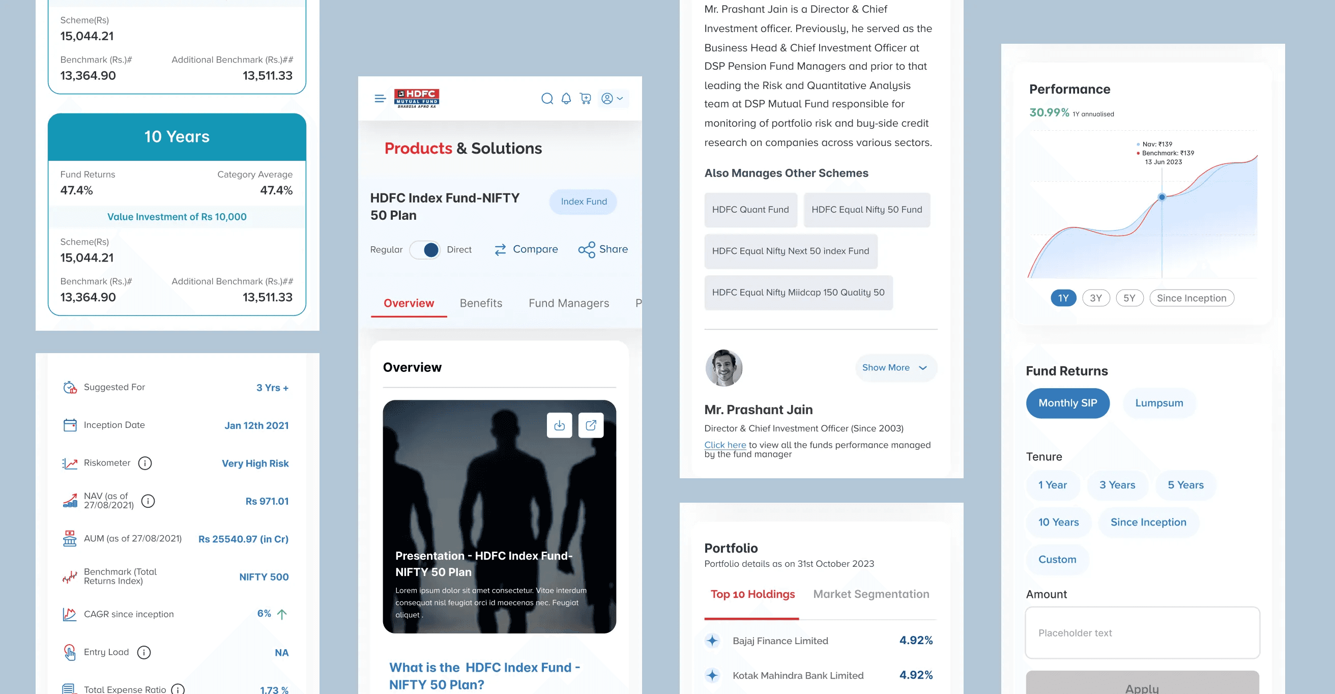
We established a scalable design system with accessible color contrast, modular components, and flexible layouts. The entire platform was built to perform beautifully on web and mobile alike.
Results & Impact
While some outcomes are still being measured post-launch, early signs are promising:
30% faster onboarding
Higher engagement on mobile
Increased fund exploration
Positive qualitative feedback
One of our test users described the redesign as “less like reading a bank brochure and more like using a fitness app for your money” we’ll take that as a win.
Closing thoughts
Designing for fintech comes with its own set of challenges: compliance, complexity, and the need to earn trust instantly. But it’s also deeply rewarding.
With the HDFC Mutual Fund project, we weren’t just redesigning a website—we were redesigning confidence. For new investors taking their first step, and for veterans optimizing every rupee, our goal was to make finance feel just a little less scary and a lot more human.
After all, investments are about building futures—and good design can be the bridge that gets us there.
Introduction
HDFC Asset Management Company (AMC) Ltd., widely known as HDFC Mutual Fund, is one of the most trusted and established players in India’s mutual fund industry. Backed by the legacy of the HDFC Group and the global expertise of Standard Life Investments, the platform offers a diverse range of schemes catering to various investor profiles—from cautious first-timers to seasoned wealth managers.
With over 210 branches across 200+ Indian cities, the brand enjoys not only a vast geographic footprint but also a powerful emotional connect with its users. However, in the digital age, even the strongest legacies need to evolve.
The challenge
Investments are deeply personal. Users aren’t just clicking buttons, they’re entrusting a platform with their hard-earned money and financial dreams. And yet, the existing HDFC Mutual Fund website failed to communicate this sense of care and clarity. It was functional, yes—but far from intuitive. Through stakeholder interviews, heuristic evaluations, and usability testing, we identified key pain points:
1. Information Overload
Users often landed on dense pages packed with financial jargon, multiple CTAs, and very little contextual guidance. Many didn’t know where to begin.
2. Trust Gaps for New Users
While HDFC as a brand was trusted, the digital experience didn’t instill the same confidence—especially for users unfamiliar with mutual fund terminology.
3. Clunky Navigation
Key actions like comparing schemes, starting a SIP, or tracking a portfolio required multiple steps and weren't easily discoverable.
4. Outdated Visual Language
The design lacked cohesion and didn't reflect the brand's stature in the financial domain. Icons, charts, and layouts felt generic and dated.
5. Mobile Accessibility Issues
In a country with increasing mobile-first behaviour, the site’s experience on smaller screens was suboptimal resulting in high drop-off rates.
6.Regulatory Boundaries from SEBI
As with any platform operating in the financial domain, especially mutual funds, there were strict compliance guidelines laid out by SEBI (Securities and Exchange Board of India). From how data could be presented to the wording of disclaimers, many design decisions had to walk the fine line between creativity and compliance. For instance, we couldn’t tweak certain labels, modify statutory disclosures, or promote any scheme too aggressively—even if a better UX begged for it. It was a masterclass in constraint-based design and we embraced it.
Our Approach
We grounded our design strategy in the principles of clarity, trust, and empowerment. The goal was to help users feel in control of their investment journey—whether they were just starting out or actively managing a multi-crore portfolio.
Market & Competitor research
We evaluated both traditional AMCs and modern digital investment platforms to understand the current experience landscape.
Our takeaway: HDFC had the brand trust. What it needed was modern experience design to match.
We didn’t just solve problems, we reimagined the experience from the ground up. Here's how we brought the new HDFC Mutual Fund platform to life
Investments made mutually engaging
Accessing the dashboard was quite a complex task. We simplified the login process by making it shorter, more engaging, and consequently, convenient. With a simple and clean touch of aesthetics, the work portfolio became easy to understand too. The overall look and feel of the website was translated to one that is less overwhelming, more welcoming.
1. Welcome Redesign: From Login to Dashboard
We streamlined the login process and designed a dashboard that felt more like a personal investment assistant than a control panel. Key actions like “Track My Investments,” “Start a SIP,” and “Explore Funds” were surfaced upfront.
2. Fund Discovery That Makes Sense
Instead of listing funds by categories users didn’t fully understand, we added goal-based discovery. “Planning for Retirement?”, “Saving for Your Child’s Education?”, or “Looking for Tax Benefits?” each goal led to curated schemes with relevant information.
3. Content That Educates, Not Confuses
We paired financial information with helpful tooltips, microcopy, and short explainer videos. We also implemented glossary modals for financial terms just in case users wanted to impress their accountant later.
4. Visualising Data With Empathy
Interactive graphs replaced static data tables. Users could now toggle views, compare schemes, and explore fund performance over time all through responsive, accessible visual components.
5. Interactive Tools That Empowered
We developed calculators for SIP planning, tax-saving potential, and long-term projections each with real-time feedback and simple sliders. The tools not only supported decisions but encouraged users to experiment and learn.
6. Consistency, Responsiveness, and Delight
We established a scalable design system with accessible color contrast, modular components, and flexible layouts. The entire platform was built to perform beautifully on web and mobile alike.
Results & Impact
While some outcomes are still being measured post-launch, early signs are promising:
30% faster onboarding
Higher engagement on mobile
Increased fund exploration
Positive qualitative feedback
One of our test users described the redesign as “less like reading a bank brochure and more like using a fitness app for your money” we’ll take that as a win.
Closing thoughts
Designing for fintech comes with its own set of challenges: compliance, complexity, and the need to earn trust instantly. But it’s also deeply rewarding.
With the HDFC Mutual Fund project, we weren’t just redesigning a website—we were redesigning confidence. For new investors taking their first step, and for veterans optimizing every rupee, our goal was to make finance feel just a little less scary and a lot more human.
After all, investments are about building futures—and good design can be the bridge that gets us there.
Problem Statement
HDFC Mutual Fund's platform didn't match its brand trust. Users faced jargon-heavy pages, unclear navigation for basic actions, an outdated look, and a weak mobile experience, all while staying within strict SEBI compliance rules.
Solution
A clearer, more guided experience: simplified login and dashboard, goal-based fund discovery, plain-language content with tooltips, interactive data visuals instead of static tables, and built-in SIP and tax calculators, all within a consistent, mobile-friendly design system.
Banking app